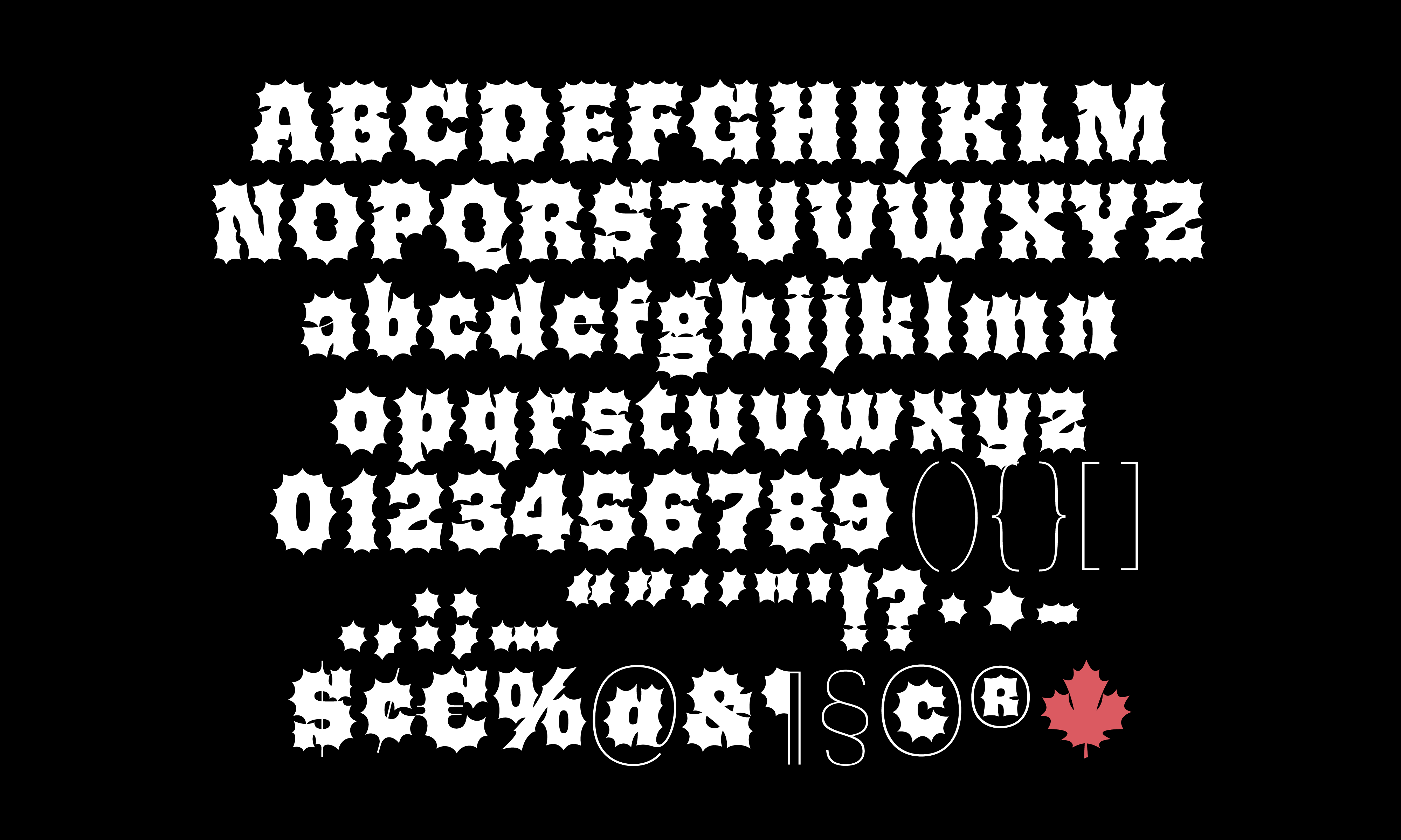
Banger is loosely inspired by metal album covers. Honestly, it started as a failed attempt at sketching metal-style lettering, but luckily for us all, I think I turned it around. It wasn’t supposed to be a typeface, but it happened to turn into one.

I can get kind of distracted, and sometimes finding a word to letter is difficult for me. What happened was I got a little hung up on writing the word “Bang,” and turning the letters into explosions. Sue me. Explosive letters are surprisingly hard to handle. Determining each letter’s visual boundaries was especially challenging. I found it difficult to retain the structure of the B. The spikes formed a gestalt zone that took on a less defined shape, making the letter feel amorphous and unrefined.
I’ll probably say this a lot, but sometimes you just got to let an idea marinate. The brainwaves can hit a couple of months later. Just ride the wave. Type design is jazz, man. I think one of the more interesting challenges of organising shapes into a typeface is how one manages to do it. Things can come together in so many different configurations; and the challenge is choosing how. What system can I come up with to manage the challenges that these shapes will undeniably present? What logic can I provide the design that will still make sense to me far down in the production process? How will I be able to live with myself tomorrow? Important questions to ask yourself in type design. This is the stuff that turns a sketch into a typeface.
The main challenges that came to pass in designing Banger were the same ones I found difficult while sketching.
- How can I define the letter's structure?
- What the fuck are these spikes doing?
Structure
Structure can be defined in several ways, but in this particular case it's a description of the underlying skeleton of the typeface. How would I write this if I had an imaginary pen that could? What is the larger system that I'm choosing to create the shapes?
I had difficulty while sketching in trying to make the B not look like a G. The top half of the letter felt indeterminate, and the crossbar had already needed to be carefully adjusted to not look like a G. I leant on my familiarity with blackletter and other forms of broad-nibbed letter construction, and decided to add a notch to the top stroke. This provided enough of a distinction, and made for a fun design feature that I knew I could use elsewhere.
Spikes and Circles
One of the features that I wanted to retain as this moved from sketch to digital was the contrasting nature of the round counter and its outer forms. There was something charming about the bubbly centre in the middle of this prickly shape. The counters, however, needed to be carefully adjusted to suggest structure and bounds. They couldn’t be too round or too square, and had to be subtle enough to suggest the outer shape. Whatever the heck that was.
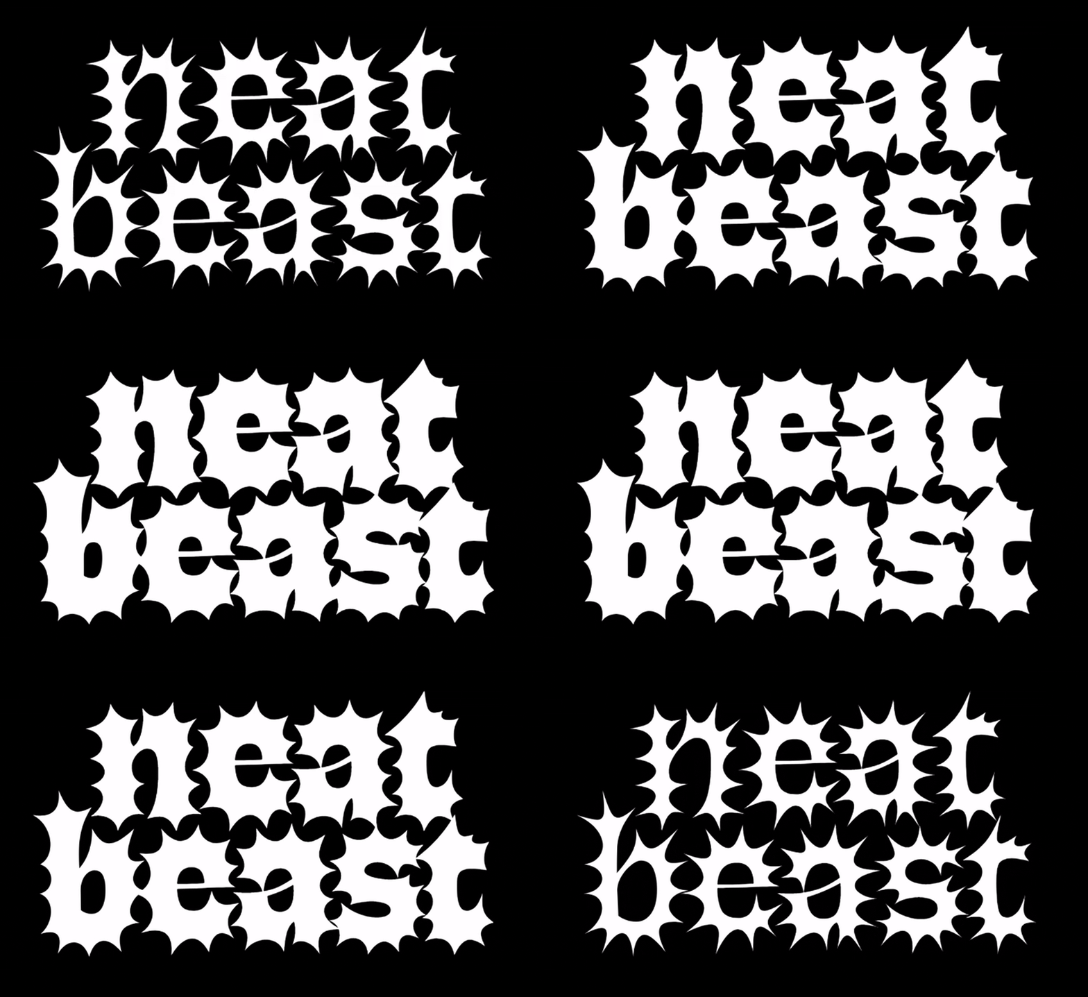
The spikes were also difficult to grasp. I had to consider all the negative space created by the spikes and how it was affecting the structure of each letter. Since the bounds of the letter were not defined by clear boundaries, shifting the thickness of a letter stem or determining an arc of a letter stroke took more care than usual. I also wanted the font to be relatively legible with highly designed features, meaning certain concessions needed to be made. The spikes were shortened and the features were reined in. Tension was critical here. Each spike had to be long enough to be noticed, but not so long that the vertex disappeared.

Another question that presented itself was, how many spikes is too many spikes? The sketch had a rough rule, and wasn’t all that clear. The n looked the most resolved, but I still didn’t have a system I could follow. What I did have though by this point was the typeface’s structural connection to blackletter.
Typographic problems are often an entangled mess, and one ill-considered ‘genius’ solution can be your production pitfall. Luckily, this was not the case. The blackletter influence made it easy for me to think of the spikes like spurs and follow through with the placement of each. The spikes were spaced along each letter as to not directly point into a spike of the next (to the best of my ability), since set spacing could often lead to a clash.
Banger
Banger turned out to be an enormous lesson. About what, you may ask? Shapes, I guess. But as dumb as it sounds, that’s kind of my job. Turning shapes into systems, rationalising each part of the design, and making a stupid idea into a functional typeface. It can even win you awards! Banger got a Judge’s Choice award at TDC in 2025. It just goes to show where a little stubbornness can take you, and I’ve got that in spades!
See more Banger ↗.